Green Bay Packers Proof of Concept Uniforms
Green Bay Packers Proof of Concept Uniforms
Every once in a while I stumble upon something great on the internets. Most of the time it is by accident and quite honestly, nine times out of ten, I’m not even sure how I ended up to my final destination. Today was one of these instances. A few days ago our carpool was discussing all the important things in life: tv shows, women, politics, movies and of course sports. One topic that came up was an idea for a website that would aggregate all the fines the NFL had handed out each week and present that information in a clean format for fans to consume. Long story short, I checked to see if NFLfines.com was registered, and of course it was not. So I got to work. During my research I thought it would be a great idea to develop a logo for this digital endeavor. That led me to a google search of NFL logos which led me to a very obscure website that contain the following images of a proof of concept for new Green Bay Packers uniforms. The blog post was from Feb 25, 2012. That post led me to the original posting by a website of what looks to be a design firm in Minneapolis (http://www.bkrdsn.com/).
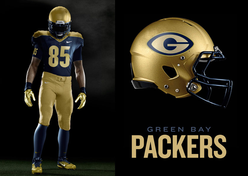
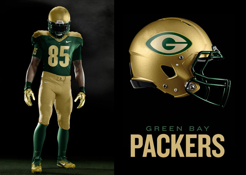
I was not satisfied. I wanted the backstory on this. Why the hell would a Minneapolis design firm be making a proof of concept for a new Green Bay Packers jersey? So I dug deeper. At this point I’d like to share a little tool that is quite helpful in the age of the internet. It’s called The Way Back Machine. It’s kind of like an ongoing archive of websites. They take snapshots in time of most websites. The more traffic a site gets the more likely it will be indexed there (I think - I really don’t know how that witch craft works…).So I took my search there and low and behold I discovered the original posting (B Inspired: NFL Teams Feb. 6th 2012). Since then that post has been taken down, but I couldn’t help but revive it. I think these concepts are great and before people get there pitchforks out and claim there is nothing wrong with Green Bay’s current uniforms I want to say that I totally agree. But I also think that sometimes enhancements can be made. For instance, the idea of making the “G” within the helmet more football shaped may rub people the wrong way. Personally I think it is witty design - it ties it together with the sport. Also, for years I’ve always wondered what the Green and Gold could look like with a truer gold color - both in their helmets and pants.
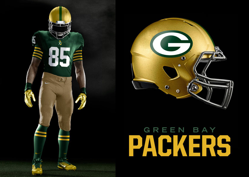
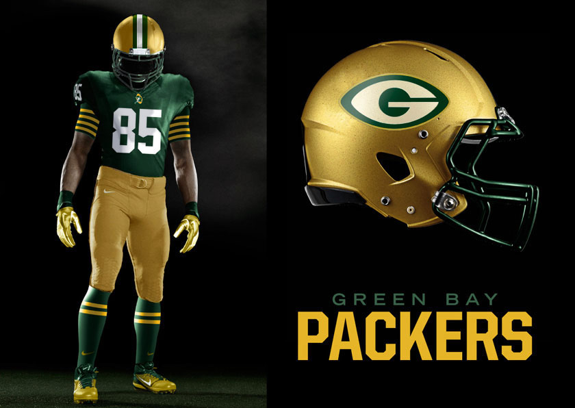
Ok, I’m going to get off my soap box for now. Please check out the other two blog posts that I’ve linked above. They deserve all the credit on this one. I am going to post a few of my own tweaks below to these already wonderful proof of concept designs. Like, what the away uniforms could look like, as well as tweaking the helmet design and shifting the gold colors around a bit.
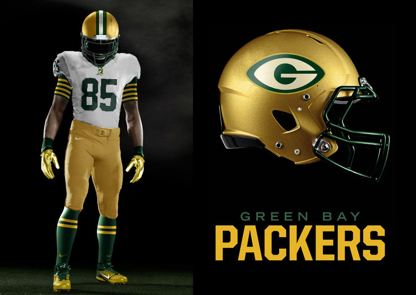
Thoughts?
What do you think of these designs? Let us know below or over on our Facebook Page - I’d love to keep the conversation rolling going into the big playoff weekend! Enjoy and carry on.